Motion foundations:
Shared Body Language
Pinterest was going through a major product redesign. Motion had no foundation to build on – no shared principles, no tokens, no specs. Every team made their own calls.
Same interaction, different timing on iOS, Android, and Web. Easing values picked ad hoc. Specs rarely written – engineers built from memory or guesswork. The product moved, but it didn't say anything consistent.
I built Pinterest's motion system from scratch: principles, easing tokens, component specs, adoption playbook. It gave teams a shared language for how the product moves.
ROLE
Product Designer
TEAM
Design Foundations, Pinterest
TIMELINE
2024
TOOLS

Motion at Pinterest wasn't just inconsistent — it was actively confusing. Transitions glitched. Components behaved unpredictably: a toast appeared from the top of the screen, but you could only dismiss it by swiping left. Everything — every interaction, every state change — had the same duration and the same easing curve, regardless of what was happening or why.
The product moved. It just didn't make sense.
The problem wasn't a lack of animation. It was a lack of structure.
The problem
- Turn motion from “random animations” into shared infrastructure.
- Create brand-consistent motion that scales.
- Make it adoptable in real workflows.
The challenge
before
The key decision
Before touching a single value, I had to figure out what the system was actually trying to do.
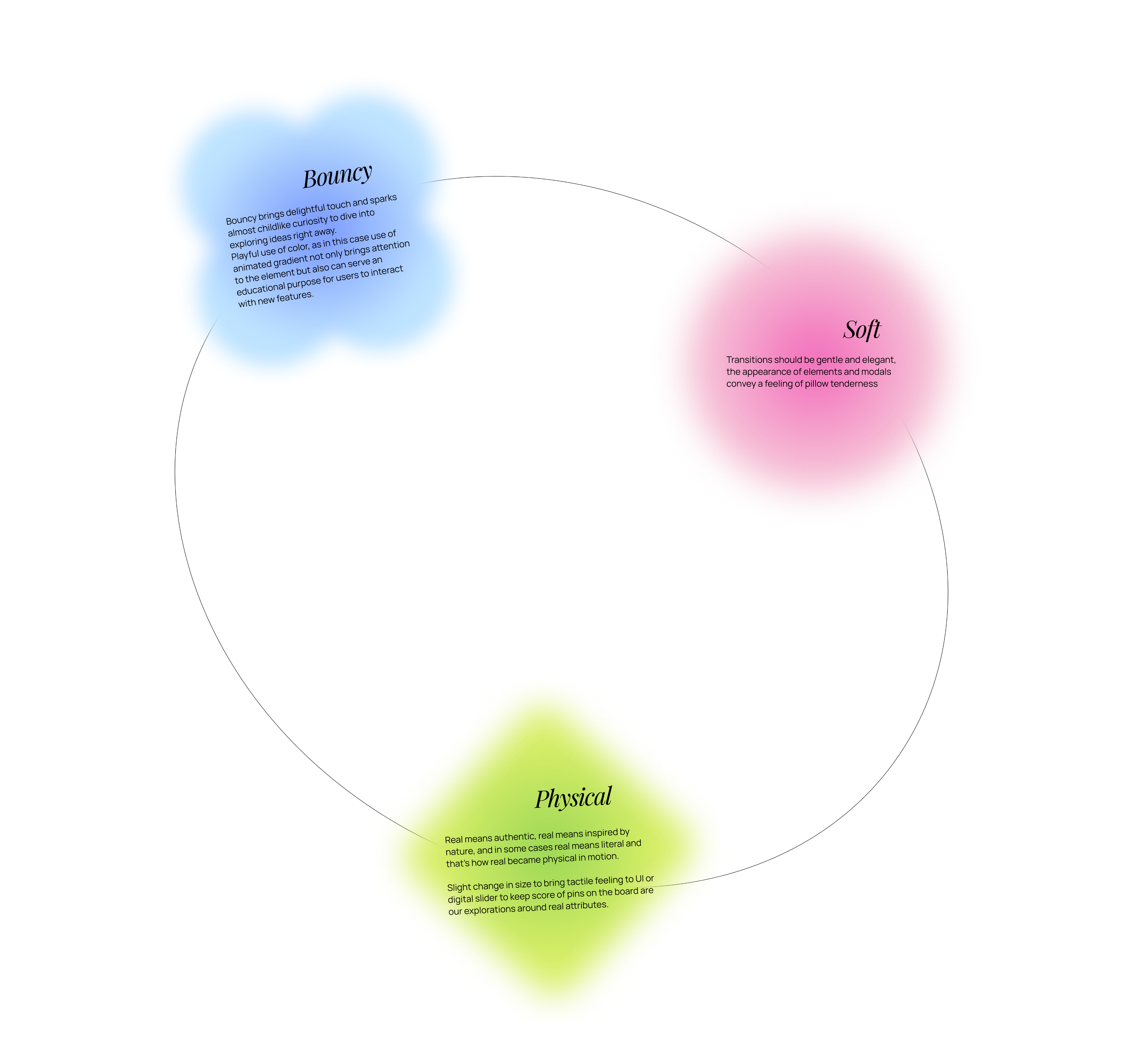
Motion at Pinterest serves two jobs that change at different speeds: helping users navigate and understand (UX), and expressing Pinterest's brand personality (visual). I split the principles into two layers – Experience and Visual – so one could stay stable while the other evolved. The system could refresh its look without breaking how it works.
That decision shaped everything that came after.
How it came together
1. Audit
Before defining anything new, I mapped what existed – animations across iOS, Android, and Web. Documented where timing contradicted itself, where motion contradicted brand tone. The audit made the problem concrete: it wasn't random noise, it was structural.
2. Principles
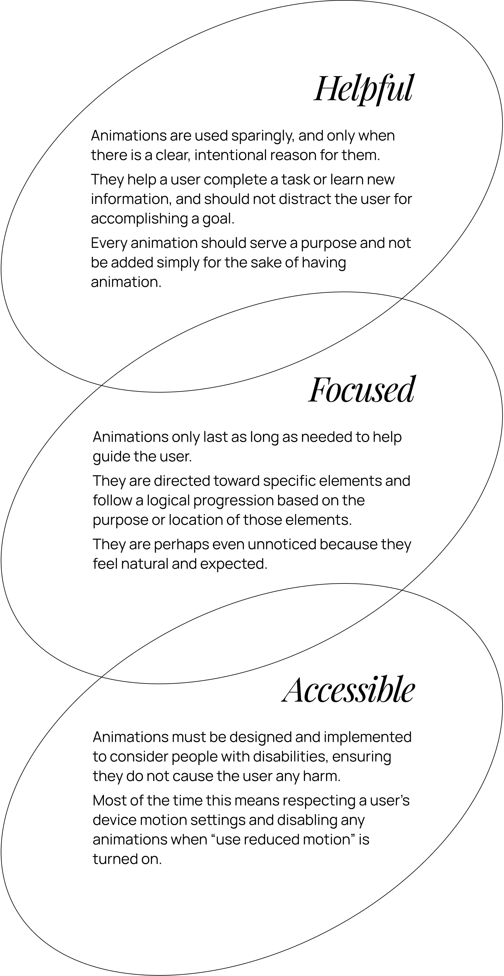
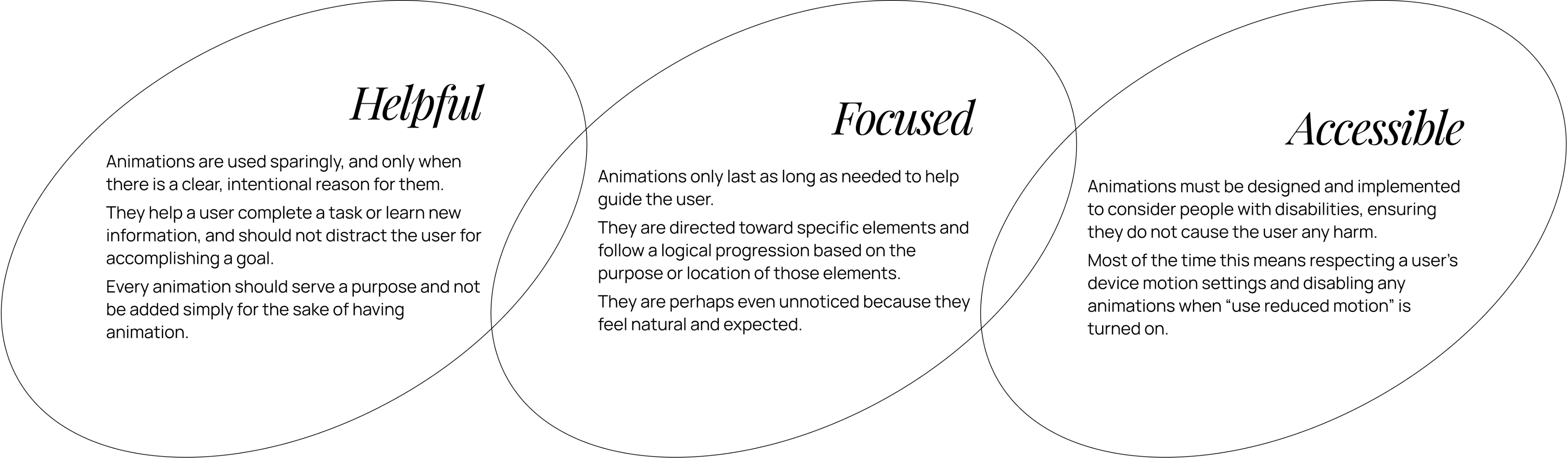
I wrote the motion principles and validated them with the team. The Experience layer defines how motion supports users – clarity, focus, meaningful feedback. Stable by design.
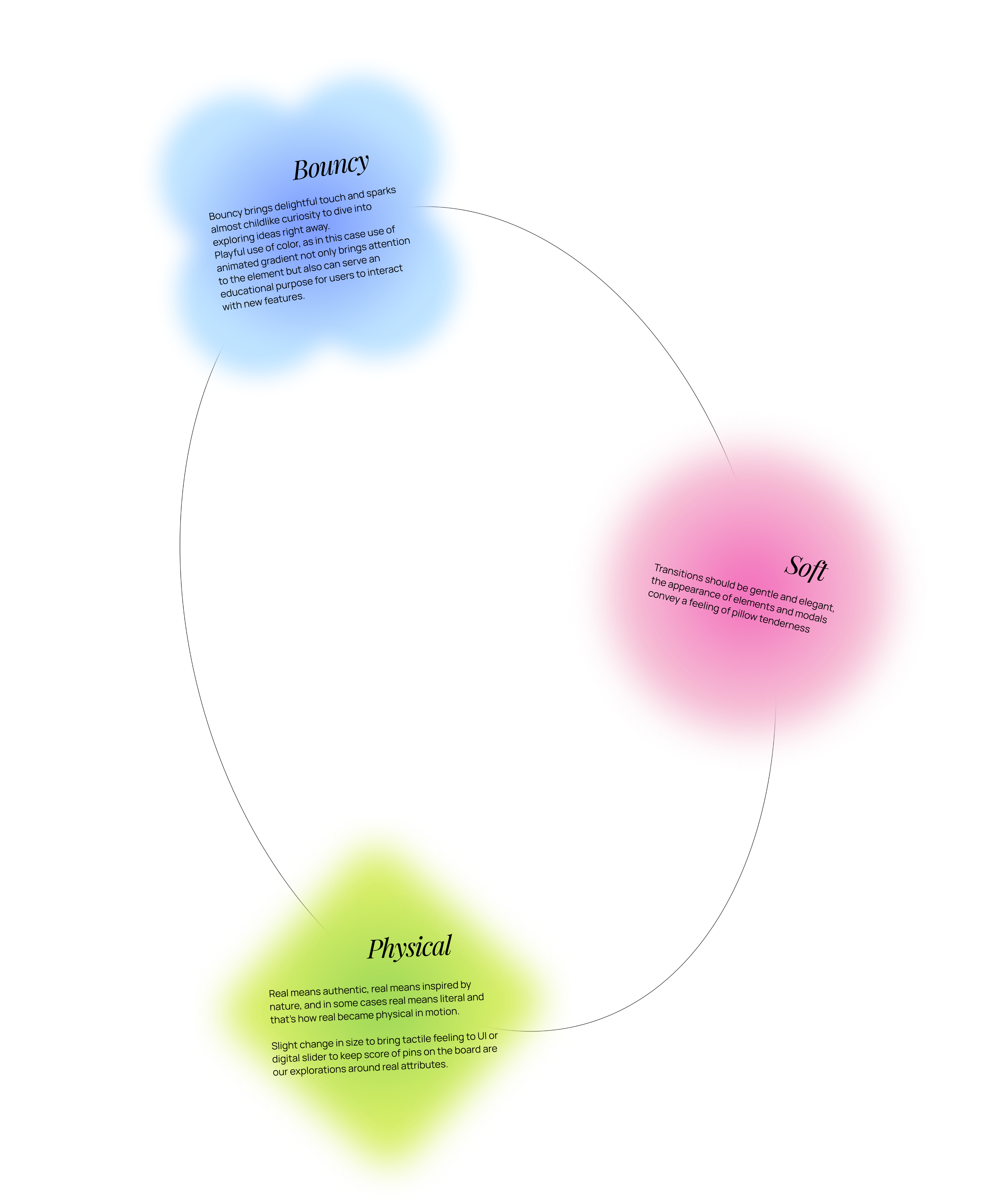
The Visual layer defines brand tone in motion. Built to evolve without destabilizing what's underneath.
4. Tokens
We validated easing and duration combinations through prototypes before translating them into implementable tokens with engineers. At one point I updated an existing token that was out of sync with the system, because consistency mattered more than leaving things untouched.
3. Easing System
Rather than picking curves case by case, I designed a reusable easing system mapped to interaction types – expressive for elements opening within the user's field of view, enter and exit for most UI transitions, lateral for navigation between surfaces. Each easing documented with cubic-bezier values, duration ranges, usage logic, and real product examples.
Alongside I define a duration scale tied to movement distance and visual weight, plus recommended easing + timing pairings for common patterns.
5. Guidance and playbook
I wrote the content and conceptual framework for the playbook and guidelines – what to use when and why. The goal was that a designer or engineer who'd never thought about motion could pick it up and make a reasonable decision.
In parallel, I introduced a standardized motion spec format, paired with interactive ProtoPie prototypes and mentored teammates on how to create system-aligned motion specs – we began producing component-level motion specs, embedding motion directly into component to reduce improvisation and ensure consistent default behavior.
By the end: motion principles published in Gestalt, easing tokens live, around 15 components with motion specs, and a spec format that teams used on new features going forward.
Motion Guidelines in Gestalt Library
Before: motion decisions lived in people's heads. Engineers guessed at easing, platforms diverged, every new animation started from scratch.
After: new features shipped using the token system. Component motion had a documented default. Design-to-engineering handoff got clearer.
Left: before – components have no motion. Right: system applied.
Duration, easing, and weight aren't guessed – they're defined.
"Adding bespoke motion to our UI components will add another layer of polish. Thank you for your attention to detail and willingness to iterate throughout this process." – Camden Asay, Gestalt Design System Manager
Impact
Our team built a motion foundation teams can actually use: principles → tokens → specs → prototypes.
Instead of shipping isolated animations, we set up a system that makes motion repeatable, consistent, and implementation-friendly. The result is motion that reinforces Pinterest’s brand and improves product clarity, while staying flexible enough to support fast-moving teams.
+
→
Before, toast had its own timing logic – or no real logic at all. It appeared from the top, but to dismiss it you'd swipe left. After establishing the system, toast became a reference point. Toolbar inherited the same weight and easing, not by coincidence but because both now pull from the same foundation. That's what a system does: one decision works across surfaces.
Animations for the Automagical Boards initiative, built following the motion system
The system made cross-team work faster.
Kirill Margolin, who managed the Automagical Boards team, put it this way:
"Whenever our team had any motion-related requests, Lesia was my go-to designer. She's someone I could fully rely on to deliver work that was well-crafted, fast, and ready to hand off to development."
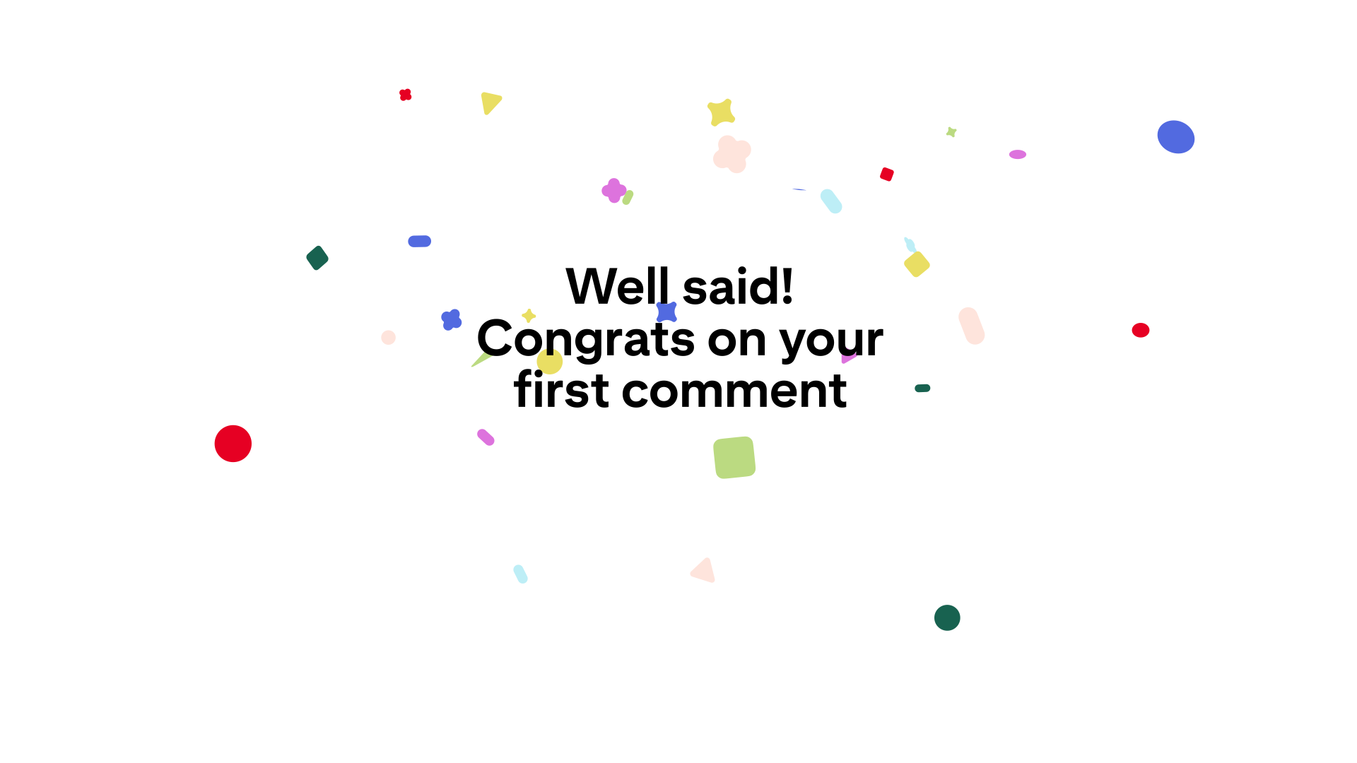
Also, the system became the foundation the Celebration System was built on. That work was UXR-validated: confetti perceived as more purposeful +37% vs. baseline.
What I'd do differently
Custom easings dated faster than expected. Springs became the default on both iOS and Material Design – if I were starting today, I'd work with what the platforms already offer rather than defining values from scratch. Better investment: clear guidance on choosing the right spring for the right context.
I'd also focus earlier on components. Built-in motion at the component level propagates quietly – other designers rarely touch it, which means if it's right, it just works. That, combined with transition documentation written earlier in the process, would have had more lasting impact than the principles layer alone.
other projects
Motion foundations:
Shared Body Language
Pinterest was going through a major product redesign. Motion had no foundation to build on – no shared principles, no tokens, no specs. Every team made their own calls.
Same interaction, different timing on iOS, Android, and Web. Easing values picked ad hoc. Specs rarely written – engineers built from memory or guesswork. The product moved, but it didn't say anything consistent.
I built Pinterest's motion system from scratch: principles, easing tokens, component specs, adoption playbook. It gave teams a shared language for how the product moves.
ROLE
Product Designer
TEAM
Design Foundations,
TIMELINE
2024
TOOLS
The problem
The challenge
Motion at Pinterest wasn't just inconsistent — it was actively confusing. Transitions glitched. Components behaved unpredictably: a toast appeared from the top of the screen, but you could only dismiss it by swiping left. Everything — every interaction, every state change — had the same duration and the same easing curve, regardless of what was happening or why.
The product moved. It just didn't make sense.
The problem wasn't a lack of animation. It was a lack of structure.
- Turn motion from “random animations” into shared infrastructure.
- Create brand-consistent motion that scales.
- Make it adoptable in real workflows.
before
The key decision
Before touching a single value, I had to figure out what the system was actually trying to do.
Motion at Pinterest serves two jobs that change at different speeds: helping users navigate and understand (UX), and expressing Pinterest's brand personality (visual). I split the principles into two layers – Experience and Visual – so one could stay stable while the other evolved. The system could refresh its look without breaking how it works.
That decision shaped everything that came after.
How it came together
1. Audit
Before defining anything new, I mapped what existed – animations across iOS, Android, and Web. Documented where timing contradicted itself, where motion contradicted brand tone. The audit made the problem concrete: it wasn't random noise, it was structural.
2. Principles
I wrote the motion principles and validated them with the team. The Experience layer defines how motion supports users – clarity, focus, meaningful feedback. Stable by design.
The Visual layer defines brand tone in motion. Built to evolve without destabilizing what's underneath.
4. Tokens
We validated easing and duration combinations through prototypes before translating them into implementable tokens with engineers. At one point I updated an existing token that was out of sync with the system, because consistency mattered more than leaving things untouched.
3. Easing System
Rather than picking curves case by case, I designed a reusable easing system mapped to interaction types – expressive for elements opening within the user's field of view, enter and exit for most UI transitions, lateral for navigation between surfaces. Each easing documented with cubic-bezier values, duration ranges, usage logic, and real product examples.
Alongside I define a duration scale tied to movement distance and visual weight, plus recommended easing + timing pairings for common patterns.
5. Guidance and playbook
I wrote the content and conceptual framework for the playbook and guidelines – what to use when and why. The goal was that a designer or engineer who'd never thought about motion could pick it up and make a reasonable decision.
In parallel, I introduced a standardized motion spec format, paired with interactive ProtoPie prototypes and mentored teammates on how to create system-aligned motion specs – we began producing component-level motion specs, embedding motion directly into component to reduce improvisation and ensure consistent default behavior.
By the end: motion principles published in Gestalt, easing tokens live, around 15 components with motion specs, and a spec format that teams used on new features going forward.
Motion Guidelines in Gestalt Library
Before: motion decisions lived in people's heads. Engineers guessed at easing, platforms diverged, every new animation started from scratch.
After: new features shipped using the token system. Component motion had a documented default. Design-to-engineering handoff got clearer.
Impact
Left: before – components have no motion. Right: system applied.
Duration, easing, and weight aren't guessed – they're defined.
"Adding bespoke motion to our UI components will add another layer of polish. Thank you for your attention to detail and willingness to iterate throughout this process." – Camden Asay, Gestalt Design System Manager
Our team built a motion foundation teams can actually use: principles → tokens → specs → prototypes.
Instead of shipping isolated animations, we set up a system that makes motion repeatable, consistent, and implementation-friendly. The result is motion that reinforces Pinterest’s brand and improves product clarity, while staying flexible enough to support fast-moving teams.
→
+
Before, toast had its own timing logic – or no real logic at all. It appeared from the top, but to dismiss it you'd swipe left. After establishing the system, toast became a reference point. Toolbar inherited the same weight and easing, not by coincidence but because both now pull from the same foundation. That's what a system does: one decision works across surfaces.
Animations for the Automagical Boards initiative, built following the motion system
The system made cross-team work faster.
Kirill Margolin, who managed the Automagical Boards team, put it this way:
"Whenever our team had any motion-related requests, Lesia was my go-to designer. She's someone I could fully rely on to deliver work that was well-crafted, fast, and ready to hand off to development."
Also, the system became the foundation the Celebration System was built on. That work was UXR-validated: confetti perceived as more purposeful +37% vs. baseline.
What I'd do differently
Custom easings dated faster than expected. Springs became the default on both iOS and Material Design – if I were starting today, I'd work with what the platforms already offer rather than defining values from scratch. Better investment: clear guidance on choosing the right spring for the right context.
I'd also focus earlier on components. Built-in motion at the component level propagates quietly – other designers rarely touch it, which means if it's right, it just works. That, combined with transition documentation written earlier in the process, would have had more lasting impact than the principles layer alone.
other projects
Motion foundations:
Shared Body Language
Pinterest was going through a major product redesign. Motion had no foundation to build on – no shared principles, no tokens, no specs. Every team made their own calls.
Same interaction, different timing on iOS, Android, and Web. Easing values picked ad hoc. Specs rarely written – engineers built from memory or guesswork. The product moved, but it didn't say anything consistent.
I built Pinterest's motion system from scratch: principles, easing tokens, component specs, adoption playbook. It gave teams a shared language for how the product moves.
ROLE
Product Designer
TEAM
Design Foundations,
TIMELINE
2024
TOOLS

Motion at Pinterest wasn't just inconsistent — it was actively confusing. Transitions glitched. Components behaved unpredictably: a toast appeared from the top of the screen, but you could only dismiss it by swiping left. Everything — every interaction, every state change — had the same duration and the same easing curve, regardless of what was happening or why.
The product moved. It just didn't make sense.
The problem wasn't a lack of animation. It was a lack of structure.
- Turn motion from “random animations” into shared infrastructure.
- Create brand-consistent motion that scales.
- Make it adoptable in real workflows.
The problem
The challenge
before
The key decision
Before touching a single value, I had to figure out what the system was actually trying to do.
Motion at Pinterest serves two jobs that change at different speeds: helping users navigate and understand (UX), and expressing Pinterest's brand personality (visual). I split the principles into two layers – Experience and Visual – so one could stay stable while the other evolved. The system could refresh its look without breaking how it works.
That decision shaped everything that came after.
How it came together
1. Audit
Before defining anything new, I mapped what existed – animations across iOS, Android, and Web. Documented where timing contradicted itself, where motion contradicted brand tone. The audit made the problem concrete: it wasn't random noise, it was structural.
2. Principles
I wrote the motion principles and validated them with the team. The Experience layer defines how motion supports users – clarity, focus, meaningful feedback. Stable by design.
The Visual layer defines brand tone in motion. Built to evolve without destabilizing what's underneath.
3. Easing System
Rather than picking curves case by case, I designed a reusable easing system mapped to interaction types – expressive for elements opening within the user's field of view, enter and exit for most UI transitions, lateral for navigation between surfaces. Each easing documented with cubic-bezier values, duration ranges, usage logic, and real product examples.
Alongside I define a duration scale tied to movement distance and visual weight, plus recommended easing + timing pairings for common patterns.
4. Tokens
We validated easing and duration combinations through prototypes before translating them into implementable tokens with engineers. At one point I updated an existing token that was out of sync with the system, because consistency mattered more than leaving things untouched.
5. Guidance and playbook
I wrote the content and conceptual framework for the playbook and guidelines – what to use when and why. The goal was that a designer or engineer who'd never thought about motion could pick it up and make a reasonable decision.
In parallel, I introduced a standardized motion spec format, paired with interactive ProtoPie prototypes and mentored teammates on how to create system-aligned motion specs – we began producing component-level motion specs, embedding motion directly into component to reduce improvisation and ensure consistent default behavior.
By the end: motion principles published in Gestalt, easing tokens live, around 15 components with motion specs, and a spec format that teams used on new features going forward.
Motion Guidelines in Gestalt Library
Impact
Before: motion decisions lived in people's heads. Engineers guessed at easing, platforms diverged, every new animation started from scratch.
After: new features shipped using the token system. Component motion had a documented default. Design-to-engineering handoff got clearer.
Left: before – components have no motion. Right: system applied.
Duration, easing, and weight aren't guessed – they're defined.
"Adding bespoke motion to our UI components will add another layer of polish. Thank you for your attention to detail and willingness to iterate throughout this process." – Camden Asay, Gestalt Design System Manager
Our team built a motion foundation teams can actually use: principles → tokens → specs → prototypes.
Instead of shipping isolated animations, we set up a system that makes motion repeatable, consistent, and implementation-friendly. The result is motion that reinforces Pinterest’s brand and improves product clarity, while staying flexible enough to support fast-moving teams.
+
→
Before, toast had its own timing logic – or no real logic at all. It appeared from the top, but to dismiss it you'd swipe left. After establishing the system, toast became a reference point. Toolbar inherited the same weight and easing, not by coincidence but because both now pull from the same foundation. That's what a system does: one decision works across surfaces.
Animations for the Automagical Boards initiative, built following the motion system
The system made cross-team work faster.
Kirill Margolin, who managed the Automagical Boards team, put it this way:
"Whenever our team had any motion-related requests, Lesia was my go-to designer. She's someone I could fully rely on to deliver work that was well-crafted, fast, and ready to hand off to development."
Also, the system became the foundation the Celebration System was built on. That work was UXR-validated: confetti perceived as more purposeful +37% vs. baseline.
What I'd do differently
Custom easings dated faster than expected. Springs became the default on both iOS and Material Design – if I were starting today, I'd work with what the platforms already offer rather than defining values from scratch. Better investment: clear guidance on choosing the right spring for the right context.
I'd also focus earlier on components. Built-in motion at the component level propagates quietly – other designers rarely touch it, which means if it's right, it just works. That, combined with transition documentation written earlier in the process, would have had more lasting impact than the principles layer alone.
other projects