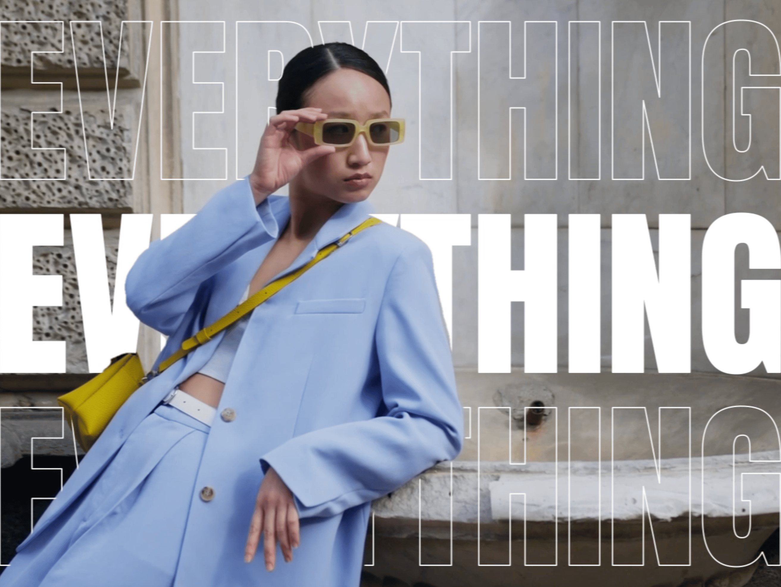
Celebration System:
Delight that Scales
Saving is Pinterest's most fundamental action – but for a long time, the feedback it triggered didn't feel that way. The confetti that appeared after a save varied by surface, wasn't reliably clear about where content had gone, and followed no shared rules for when or how to use it. Meanwhile, celebration effects across the product had proliferated into a fragmented mess: every new moment required its own design and engineering effort, and the results looked like they came from different products entirely.
The Celebration System replaced all of that with a single tiered pattern – three clearly scoped levels of celebratory feedback, grounded in the same motion principles as the rest of the product, designed to scale across platforms without turning into noise.
ROLE
Product Designer
TEAM
Design Innovations, Pinterest
TIMELINE
2025
TOOLS

Product context
Problem
The most concrete gap was functional. In saving flows, a directional confetti cue was meant to communicate where content had landed – reinforcing users' mental model of where saves go. But it wasn't standardized across layouts and platforms. Alignment could drift, particles could clip, and behavior varied unpredictably.
That fragility sat on top of a broader style problem: celebration effects had no shared intensity rules, no consistent visual language, and no guardrails on frequency. The experience felt incoherent – effects clashed with the UI and illustration style, and nothing read as distinctly Pinterest. And every new celebratory moment was a one-off effort: expensive to build, inconsistent in execution, difficult to maintain.
In 2024, Pinterest went through a major design refresh that brought token-level consistency to the UI – including motion. But that refresh addressed component-level fragmentation, not feature-level. Teams were still shipping celebratory experiences that varied wildly in style, intensity, and behavior – from character-like icons to raw collage-style elements and one-off interactions that didn't feel like they belonged to the same product.
As part of Design Innovations – the team responsible for shaping Pinterest's visual direction – my work focused on turning that vision into reusable patterns. The Celebration System was a key piece of that effort: a cross-platform, brand-aligned celebration pattern that replaces one-offs with a consistent system, alongside broader work across illustration, iconography, shape, and color language.
Celebration moments before
I designed a three-tier system with a clear, non-overlapping purpose for each level:
- Big Confetti – milestones.
Full-screen celebration for rare, high-impact achievements. Used sparingly to preserve emotional weight – if everything is a milestone, nothing is.
- Small Confetti – Save destination cue.
Mid-scale confetti used only for saving Pins and Boards. It originates from the Profile icon in the nav bar to visually confirm where content was saved, reinforcing the user's mental model of the save destination.
- Mini Confetti – subtle emphasis.
Lightweight feedback for lower-stakes moments – acknowledging success without escalating. The system needed a tier teams could reach for without defaulting to full celebration.
Solution
3-tier strip (Mini / Small / Big)
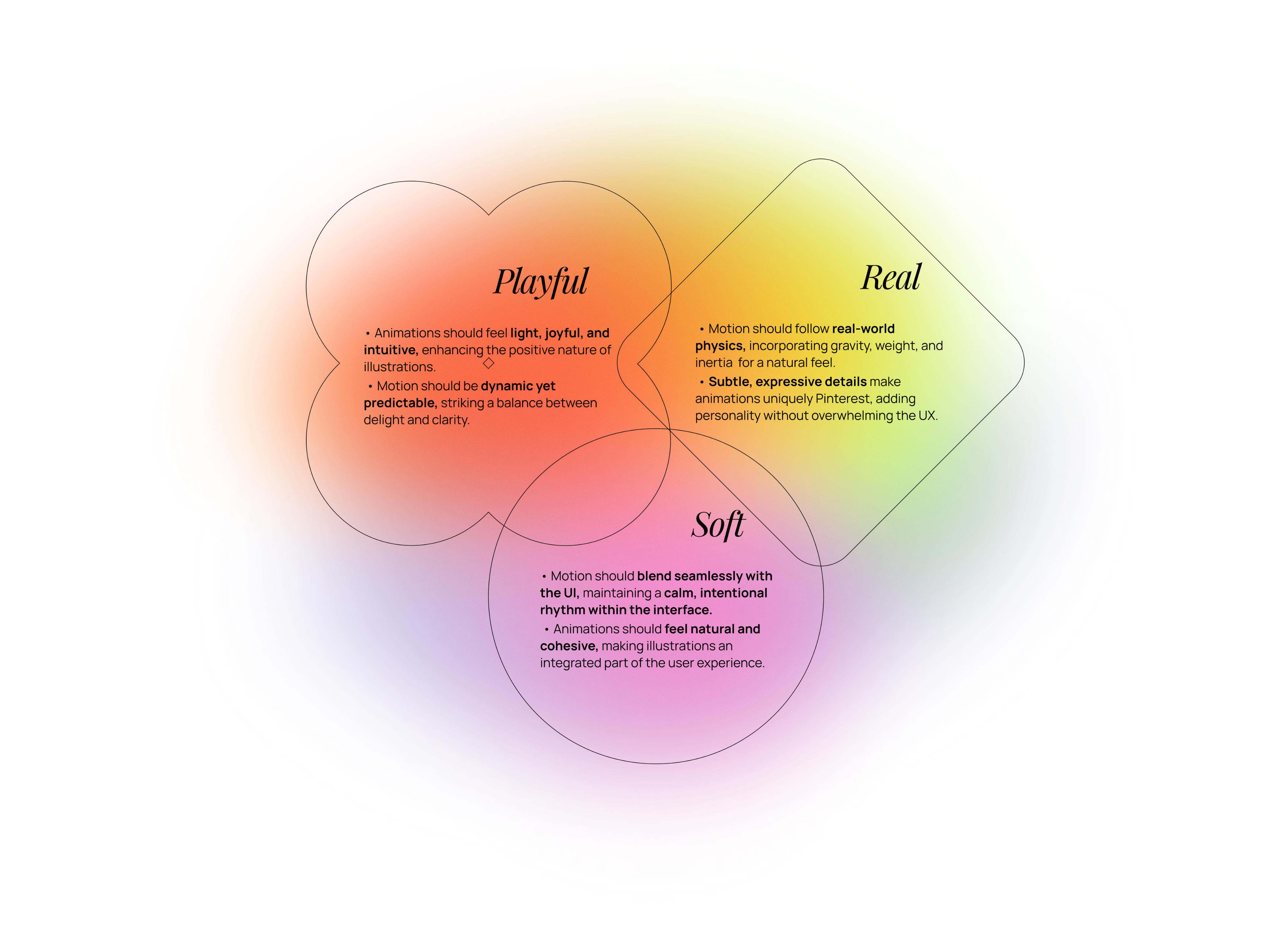
The system is grounded in the same principles I had defined while working on Pinterest's Motion Foundation – so celebration already followed the same rules as the rest of the product: clarity of feedback, calibrated intensity, platform consistency. That starting point let me focus on the harder question: what actually deserves a celebration, and at what intensity?
The tier logic came from mapping use cases to frequency and stakes. Rare, high-impact achievements get the full-screen treatment. Saving – frequent but meaningful – gets a targeted, directional cue. Low-stakes confirmations get a subtle pulse.
With the tier logic defined, I documented "anatomy + flow" specs for each tier: burst origin, particle trajectory, trigger conditions, positioning and rendering rules, and platform considerations. The confetti visuals came out of a close collaboration with illustrator Bonnie Kate Wolf – she handled the shape language and color palette, I handled bringing it to life in motion.
Process
Animation principles
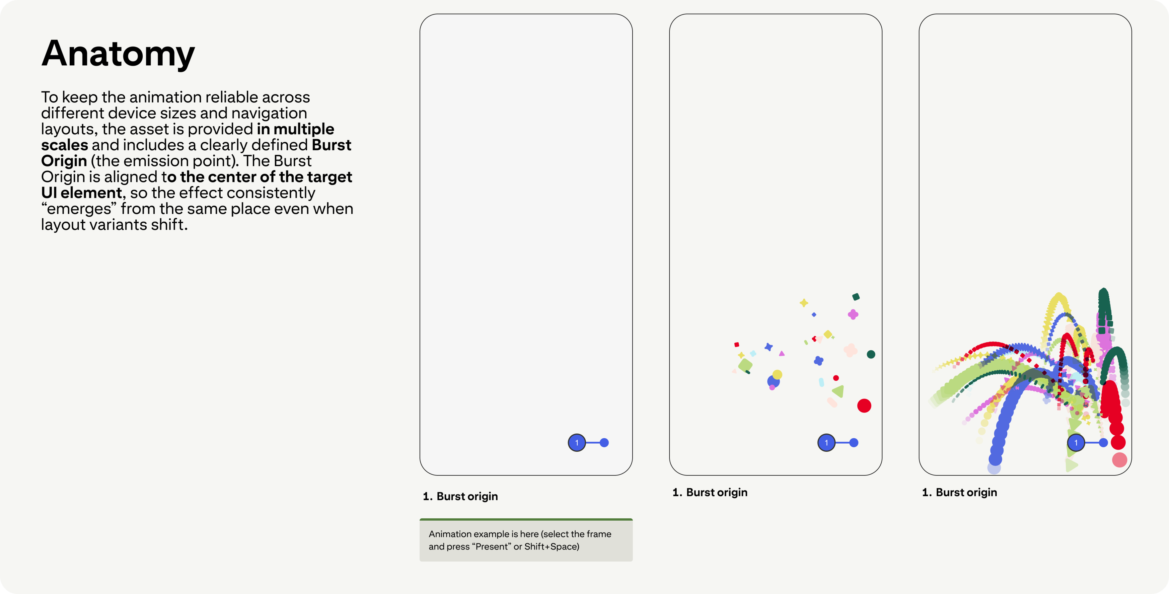
Anatomy — Burst Origin & particle trajectory
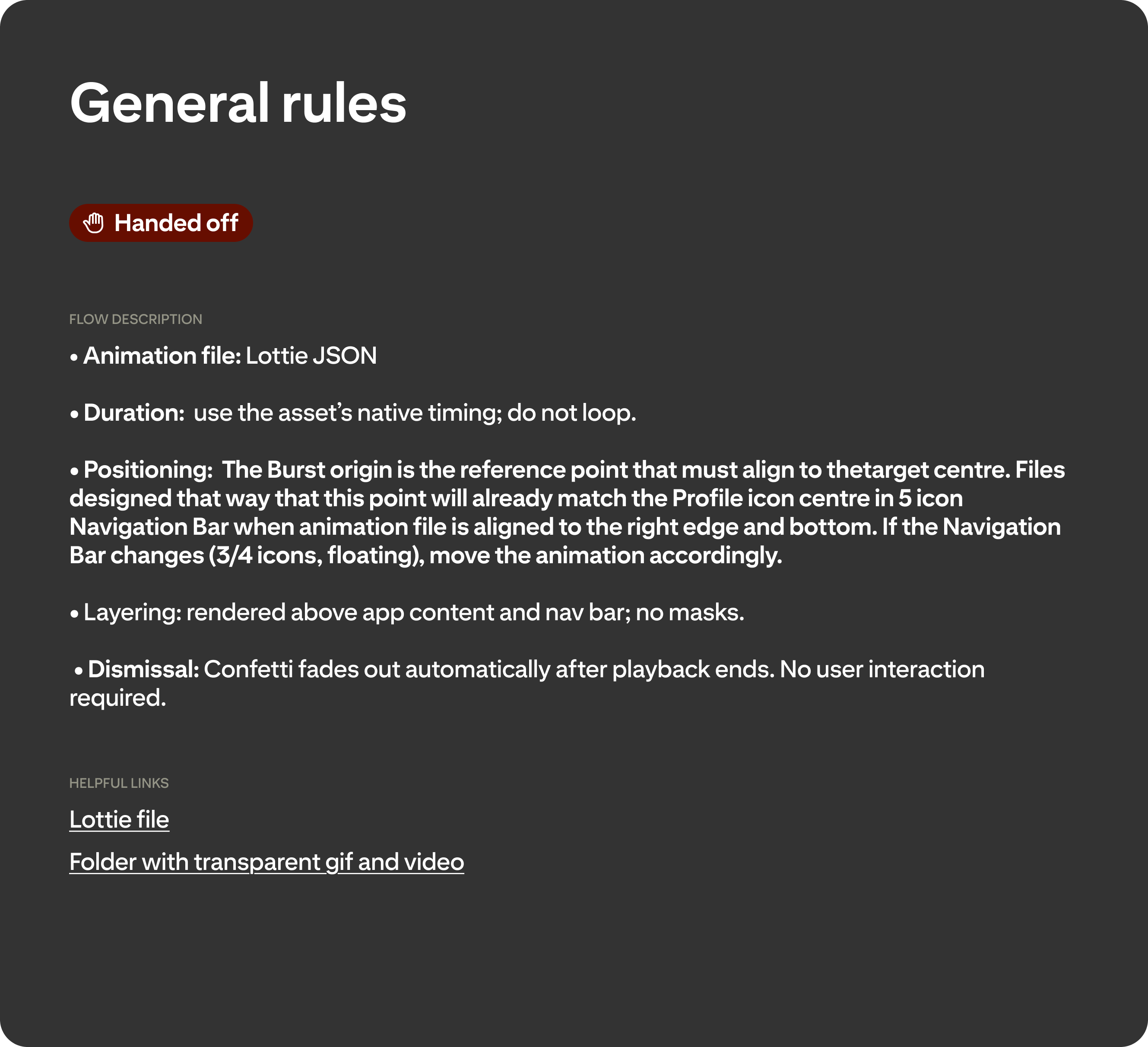
Flow — Trigger, positioning & rendering rules
The hard part wasn't the animation craft – it was making the system governable across real product variance.
Small Confetti initially assumed a stable bottom navigation. Once navigation variants started shipping – different icon counts shifting the Profile icon, floating nav – the approach became fragile: alignment could drift and particles could clip depending on layout and container behavior. Rather than blocking rollout while we resolved the final approach, I introduced a phone-safe fallback asset where particles fade out before reaching screen edges. It was a deliberate tradeoff: accept a slightly conservative version in production temporarily rather than delay shipping while chasing a perfect solution.
Mweb required a different kind of problem-solving. The animation wasn't behaving as intended, so I partnered with engineers to debug it – and we ultimately rebuilt it from scratch, gradually reintroducing complexity until it matched the intended look while staying stable and performant.
Nabeel Bokhari, the engineer I worked with most closely, put it directly:
"Thank you so much for working with us to debug our myriad animation compatibility issues on web, and to help us get our animation into a launchable state!"
The third challenge was demand. Once teams saw confetti, everyone wanted it everywhere. That's exactly why the specs include explicit use-case rules and frequency guardrails – the system only works if celebration stays meaningful, and that requires being clear about where it doesn't belong.
Tooling note: this system was built using Lottie. If I were starting today, I'd likely choose Rive – it's better suited for responsive, stateful animations that adapt to layout changes.
What was hard
Results
Confetti in production
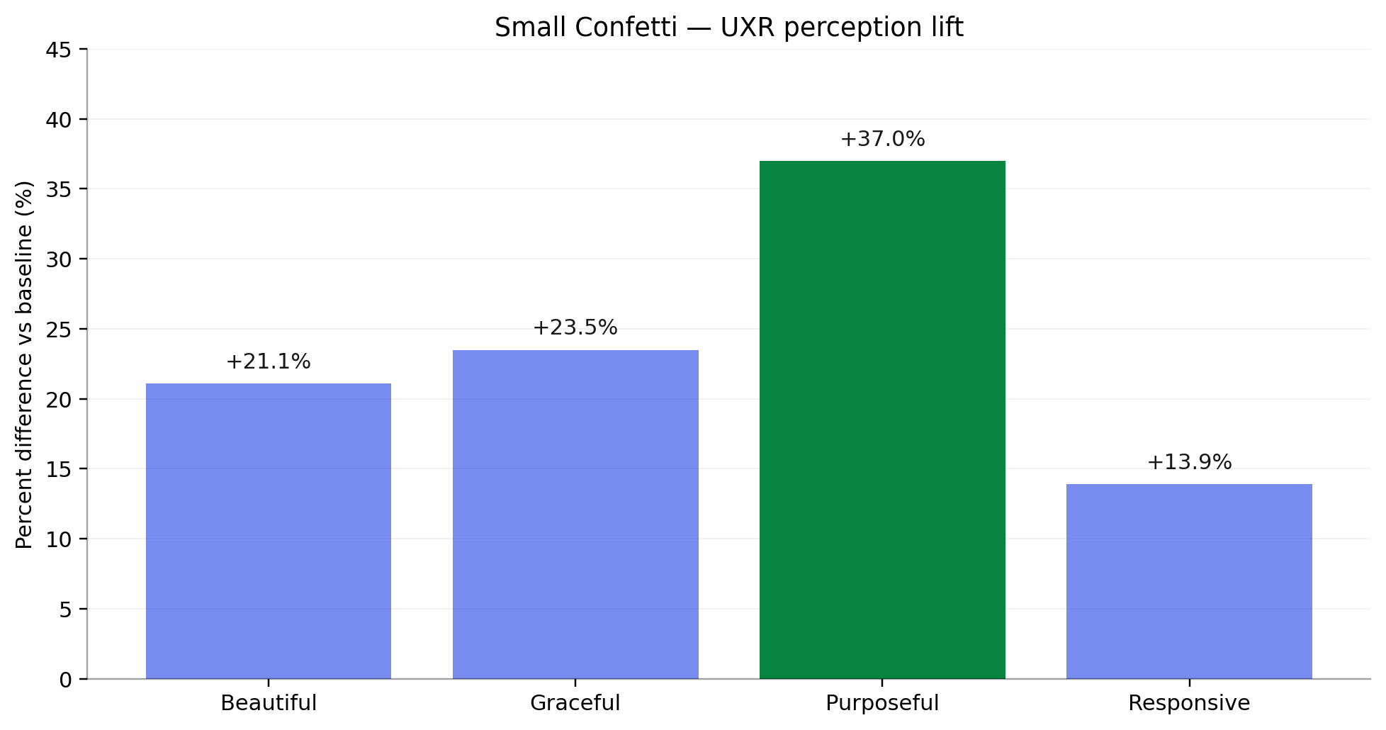
UXR: Small Confetti perception vs baseline – “Purposeful” increased by +37% (significant) after the update.
UXR validated the core goal: Small Confetti was perceived as significantly more purposeful after the update – a +37% increase vs. baseline. That result confirms the system is doing functional work, not just decorative work.
The system launched in production in October as part of Pinterest's Holiday Gift Guides – a data-backed festive shopping feature with hundreds of curated boards across 17 categories, celebrity collaborations with Pamela Anderson, the Jonas Brothers, and Zara Larsson, and a shoppable quiz driving users through the experience. For that launch, Small Confetti fired on the first save of a session rather than the standard every-5th-save cadence – a deliberate call for the discovery context, where the goal is to reinforce the save behavior from the very first interaction, not wait until the fifth.
Beyond that: the three-tier pattern shipped with clear intent and usage rules, giving teams a reusable system without the one-off overhead. Implementation-ready specs and active engineering support ensured stable behavior across layouts and platforms.
We're now converting this into a proper design-system component that adapts to platform and scenario – the next step toward eliminating inconsistent variants entirely.
other projects
Vochi Text 02 Effect
→
Motion Foundations
→
Celebration System:
Delight that Scales
Saving is Pinterest's most fundamental action – but for a long time, the feedback it triggered didn't feel that way. The confetti that appeared after a save varied by surface, wasn't reliably clear about where content had gone, and followed no shared rules for when or how to use it. Meanwhile, celebration effects across the product had proliferated into a fragmented mess: every new moment required its own design and engineering effort, and the results looked like they came from different products entirely.
The Celebration System replaced all of that with a single tiered pattern – three clearly scoped levels of celebratory feedback, grounded in the same motion principles as the rest of the product, designed to scale across platforms without turning into noise.
ROLE
Product Designer
TEAM
Design Innovations,
TIMELINE
2025
TOOLS

In 2024, Pinterest went through a major design refresh that brought token-level consistency to the UI – including motion. But that refresh addressed component-level fragmentation, not feature-level. Teams were still shipping celebratory experiences that varied wildly in style, intensity, and behavior – from character-like icons to raw collage-style elements and one-off interactions that didn't feel like they belonged to the same product.
As part of Design Innovations – the team responsible for shaping Pinterest's visual direction – my work focused on turning that vision into reusable patterns. The Celebration System was a key piece of that effort: a cross-platform, brand-aligned celebration pattern that replaces one-offs with a consistent system, alongside broader work across illustration, iconography, shape, and color language.
Product context
The most concrete gap was functional. In saving flows, a directional confetti cue was meant to communicate where content had landed – reinforcing users' mental model of where saves go. But it wasn't standardized across layouts and platforms. Alignment could drift, particles could clip, and behavior varied unpredictably.
That fragility sat on top of a broader style problem: celebration effects had no shared intensity rules, no consistent visual language, and no guardrails on frequency. The experience felt incoherent – effects clashed with the UI and illustration style, and nothing read as distinctly Pinterest. And every new celebratory moment was a one-off effort: expensive to build, inconsistent in execution, difficult to maintain.
Problem
Celebration moments before
Solution
I designed a three-tier system with a clear, non-overlapping purpose for each level:
- Big Confetti – milestones.
Full-screen celebration for rare, high-impact achievements. Used sparingly to preserve emotional weight – if everything is a milestone, nothing is.
- Small Confetti – Save destination cue.
Mid-scale confetti used only for saving Pins and Boards. It originates from the Profile icon in the nav bar to visually confirm where content was saved, reinforcing the user's mental model of the save destination.
- Mini Confetti – subtle emphasis.
Lightweight feedback for lower-stakes moments – acknowledging success without escalating. The system needed a tier teams could reach for without defaulting to full celebration.
3-tier strip (Mini / Small / Big)
Process
The system is grounded in the same principles I had defined while working on Pinterest's Motion Foundation – so celebration already followed the same rules as the rest of the product: clarity of feedback, calibrated intensity, platform consistency. That starting point let me focus on the harder question: what actually deserves a celebration, and at what intensity?
The tier logic came from mapping use cases to frequency and stakes. Rare, high-impact achievements get the full-screen treatment. Saving – frequent but meaningful – gets a targeted, directional cue. Low-stakes confirmations get a subtle pulse.
With the tier logic defined, I documented "anatomy + flow" specs for each tier: burst origin, particle trajectory, trigger conditions, positioning and rendering rules, and platform considerations. The confetti visuals came out of a close collaboration with illustrator Bonnie Kate Wolf – she handled the shape language and color palette, I handled bringing it to life in motion.
Animation principles
Flow — Trigger, positioning & rendering rules
Anatomy — Burst Origin & particle trajectory
The hard part wasn't the animation craft – it was making the system governable across real product variance.
Small Confetti initially assumed a stable bottom navigation. Once navigation variants started shipping – different icon counts shifting the Profile icon, floating nav – the approach became fragile: alignment could drift and particles could clip depending on layout and container behavior. Rather than blocking rollout while we resolved the final approach, I introduced a phone-safe fallback asset where particles fade out before reaching screen edges. It was a deliberate tradeoff: accept a slightly conservative version in production temporarily rather than delay shipping while chasing a perfect solution.
Mweb required a different kind of problem-solving. The animation wasn't behaving as intended, so I partnered with engineers to debug it – and we ultimately rebuilt it from scratch, gradually reintroducing complexity until it matched the intended look while staying stable and performant.
Nabeel Bokhari, the engineer I worked with most closely, put it directly:
"Thank you so much for working with us to debug our myriad animation compatibility issues on web, and to help us get our animation into a launchable state!"
The third challenge was demand. Once teams saw confetti, everyone wanted it everywhere. That's exactly why the specs include explicit use-case rules and frequency guardrails – the system only works if celebration stays meaningful, and that requires being clear about where it doesn't belong.
Tooling note: this system was built using Lottie. If I were starting today, I'd likely choose Rive – it's better suited for responsive, stateful animations that adapt to layout changes.
What was hard
Results
Confetti in production
UXR: Small Confetti perception vs baseline – “Purposeful” increased by +37% (significant) after the update.
UXR validated the core goal: Small Confetti was perceived as significantly more purposeful after the update – a +37% increase vs. baseline. That result confirms the system is doing functional work, not just decorative work.
The system launched in production in October as part of Pinterest's Holiday Gift Guides – a data-backed festive shopping feature with hundreds of curated boards across 17 categories, celebrity collaborations with Pamela Anderson, the Jonas Brothers, and Zara Larsson, and a shoppable quiz driving users through the experience. For that launch, Small Confetti fired on the first save of a session rather than the standard every-5th-save cadence – a deliberate call for the discovery context, where the goal is to reinforce the save behavior from the very first interaction, not wait until the fifth.
Beyond that: the three-tier pattern shipped with clear intent and usage rules, giving teams a reusable system without the one-off overhead. Implementation-ready specs and active engineering support ensured stable behavior across layouts and platforms.
We're now converting this into a proper design-system component that adapts to platform and scenario – the next step toward eliminating inconsistent variants entirely.
other projects
Vochi Text 02 Effect
→
Motion Foundations
→
Celebration System:
Delight that Scales
Saving is Pinterest's most fundamental action – but for a long time, the feedback it triggered didn't feel that way. The confetti that appeared after a save varied by surface, wasn't reliably clear about where content had gone, and followed no shared rules for when or how to use it. Meanwhile, celebration effects across the product had proliferated into a fragmented mess: every new moment required its own design and engineering effort, and the results looked like they came from different products entirely.
The Celebration System replaced all of that with a single tiered pattern – three clearly scoped levels of celebratory feedback, grounded in the same motion principles as the rest of the product, designed to scale across platforms without turning into noise.
ROLE
Product Designer
TEAM
Design Innovations, Pinterest
TIMELINE
2025
TOOLS
In 2024, Pinterest went through a major design refresh that brought token-level consistency to the UI – including motion. But that refresh addressed component-level fragmentation, not feature-level. Teams were still shipping celebratory experiences that varied wildly in style, intensity, and behavior – from character-like icons to raw collage-style elements and one-off interactions that didn't feel like they belonged to the same product.
As part of Design Innovations – the team responsible for shaping Pinterest's visual direction – my work focused on turning that vision into reusable patterns. The Celebration System was a key piece of that effort: a cross-platform, brand-aligned celebration pattern that replaces one-offs with a consistent system, alongside broader work across illustration, iconography, shape, and color language.
Product context
The most concrete gap was functional. In saving flows, a directional confetti cue was meant to communicate where content had landed – reinforcing users' mental model of where saves go. But it wasn't standardized across layouts and platforms. Alignment could drift, particles could clip, and behavior varied unpredictably.
That fragility sat on top of a broader style problem: celebration effects had no shared intensity rules, no consistent visual language, and no guardrails on frequency. The experience felt incoherent – effects clashed with the UI and illustration style, and nothing read as distinctly Pinterest. And every new celebratory moment was a one-off effort: expensive to build, inconsistent in execution, difficult to maintain.
Problem
Celebration moments before
I designed a three-tier system with a clear, non-overlapping purpose for each level:
- Big Confetti – milestones.
Full-screen celebration for rare, high-impact achievements. Used sparingly to preserve emotional weight – if everything is a milestone, nothing is.
- Small Confetti – Save destination cue.
Mid-scale confetti used only for saving Pins and Boards. It originates from the Profile icon in the nav bar to visually confirm where content was saved, reinforcing the user's mental model of the save destination.
- Mini Confetti – subtle emphasis.
Lightweight feedback for lower-stakes moments – acknowledging success without escalating. The system needed a tier teams could reach for without defaulting to full celebration.
Solution
3-tier strip (Mini / Small / Big)
Process
The system is grounded in the same principles I had defined while working on Pinterest's Motion Foundation – so celebration already followed the same rules as the rest of the product: clarity of feedback, calibrated intensity, platform consistency. That starting point let me focus on the harder question: what actually deserves a celebration, and at what intensity?
The tier logic came from mapping use cases to frequency and stakes. Rare, high-impact achievements get the full-screen treatment. Saving – frequent but meaningful – gets a targeted, directional cue. Low-stakes confirmations get a subtle pulse.
With the tier logic defined, I documented "anatomy + flow" specs for each tier: burst origin, particle trajectory, trigger conditions, positioning and rendering rules, and platform considerations. The confetti visuals came out of a close collaboration with illustrator Bonnie Kate Wolf – she handled the shape language and color palette, I handled bringing it to life in motion.
Animation principles
Anatomy — Burst Origin & particle trajectory
Flow — Trigger, positioning & rendering rules
The hard part wasn't the animation craft – it was making the system governable across real product variance.
Small Confetti initially assumed a stable bottom navigation. Once navigation variants started shipping – different icon counts shifting the Profile icon, floating nav – the approach became fragile: alignment could drift and particles could clip depending on layout and container behavior. Rather than blocking rollout while we resolved the final approach, I introduced a phone-safe fallback asset where particles fade out before reaching screen edges. It was a deliberate tradeoff: accept a slightly conservative version in production temporarily rather than delay shipping while chasing a perfect solution.
Mweb required a different kind of problem-solving. The animation wasn't behaving as intended, so I partnered with engineers to debug it – and we ultimately rebuilt it from scratch, gradually reintroducing complexity until it matched the intended look while staying stable and performant.
Nabeel Bokhari, the engineer I worked with most closely, put it directly:
"Thank you so much for working with us to debug our myriad animation compatibility issues on web, and to help us get our animation into a launchable state!"
The third challenge was demand. Once teams saw confetti, everyone wanted it everywhere. That's exactly why the specs include explicit use-case rules and frequency guardrails – the system only works if celebration stays meaningful, and that requires being clear about where it doesn't belong.
Tooling note: this system was built using Lottie. If I were starting today, I'd likely choose Rive – it's better suited for responsive, stateful animations that adapt to layout changes.
What was hard
Results
Confetti in production
UXR: Small Confetti perception vs baseline – “Purposeful” increased by +37% (significant) after the update.
UXR validated the core goal: Small Confetti was perceived as significantly more purposeful after the update – a +37% increase vs. baseline. That result confirms the system is doing functional work, not just decorative work.
The system launched in production in October as part of Pinterest's Holiday Gift Guides – a data-backed festive shopping feature with hundreds of curated boards across 17 categories, celebrity collaborations with Pamela Anderson, the Jonas Brothers, and Zara Larsson, and a shoppable quiz driving users through the experience. For that launch, Small Confetti fired on the first save of a session rather than the standard every-5th-save cadence – a deliberate call for the discovery context, where the goal is to reinforce the save behavior from the very first interaction, not wait until the fifth.
Beyond that: the three-tier pattern shipped with clear intent and usage rules, giving teams a reusable system without the one-off overhead. Implementation-ready specs and active engineering support ensured stable behavior across layouts and platforms.
We're now converting this into a proper design-system component that adapts to platform and scenario – the next step toward eliminating inconsistent variants entirely.
other projects
Vochi Text 02 Effect
→
Motion Foundations
→